Nokia 7 Plus review: Perfectly balanced value for money phone with no competition in the Rs 25,000 segment
The mid-range smartphone segment has been gradually dying out with most buyers either going in for a budget smartphone (like a Redmi Note 5 Pro) priced between Rs 10,000 to 15,000 to a low-cost flagship like a OnePlus 5T that offers premium hardware at a starting price of around Rs 33,000.
In fact, you can thank Chinese smartphone manufacturers for bringing mid-range chipsets to budget smartphones spoiling the consumer when it comes to performance.
With that in mind, most smartphone brands have seen little success with the mid-range segment as they either try to copy notched displays from the premium segment devices or try and offer under-powered hardware, which rarely makes up for their mid-range pricing (example Vivo V9).
While Nokia too has stayed away from this segment for a while, HMD’s efforts to diversify into various segment saw something new come out of the Nokia stable this year, a perfect mid-ranger that not just looks good, but is practical and comes with power-packed performance figures that for once make a mid-range device worthy of its asking price. Say hello! To the Nokia 7 Plus, the first smartphone, worthy of the mid-range title in years.
Build and Design: 9/10
With most Chinese brands busy aping the Apple iPhone X and following its notch philosophy (you can now include OnePlus in that list as well), it was surprising to see Nokia go notch-less in 2018 with the Nokia 7 Plus back at the Mobile World Congress.
Simply, put, the design is practical, looks gorgeous enough to distract an iPhone X owner and is built like a tank.
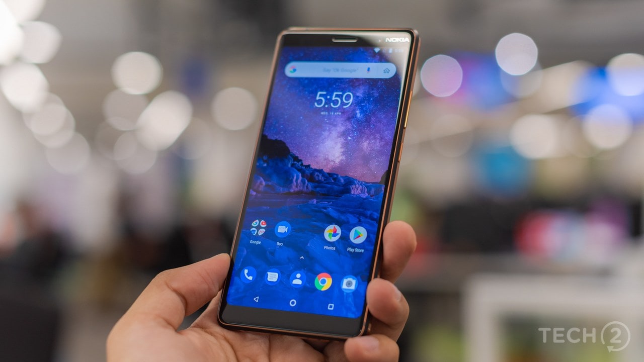 In other words, Nokia has managed to make a smartphone in the
mid-segment that will grab the attention of both mid-range and premium
segment buyers. OnePlus, you really need to have something special on
the OnePlus 6 this year!
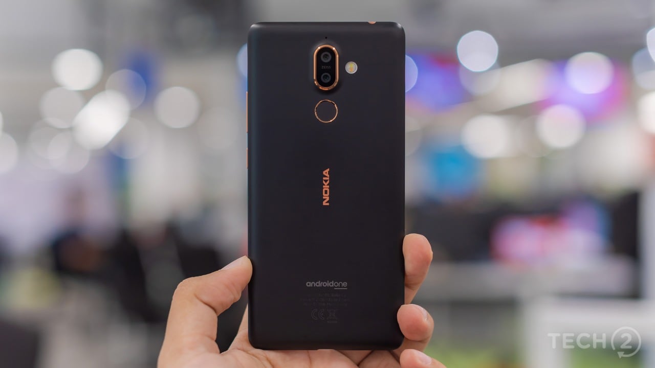 The matte black treatment with copper coloured accents (especially
the idea of one placed around the screen) somehow reminded me of those
crazy Nokia designs of the past, that were inspired more by trends in
fashion than being practical (they came in weird shapes and sizes, but
they sure looked cool). I loved how Nokia managed to mount the 2.5 D
curved-edge screen without a visible lipping (that usually makes it
scratchy when you swipe at the edges) and exposed the metal bezel with a
copper finish before the ceramic coating takes over, sliding into the
sides.
 The design feels luxurious and certainly does not pass off as
something that will be priced in sub Rs 30,000 range, both in terms of
its looks and the construction quality.
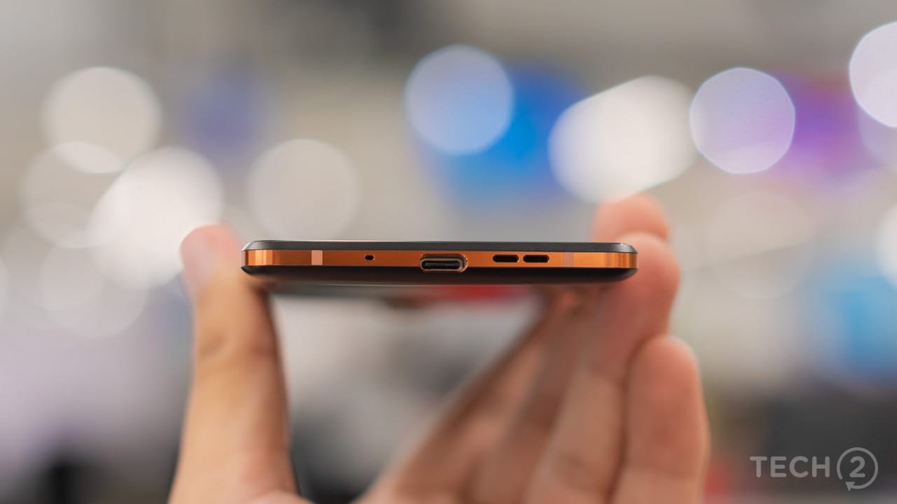 The breath-taking design makes you want to hold the smartphone, just because it looks so good lying on the table.
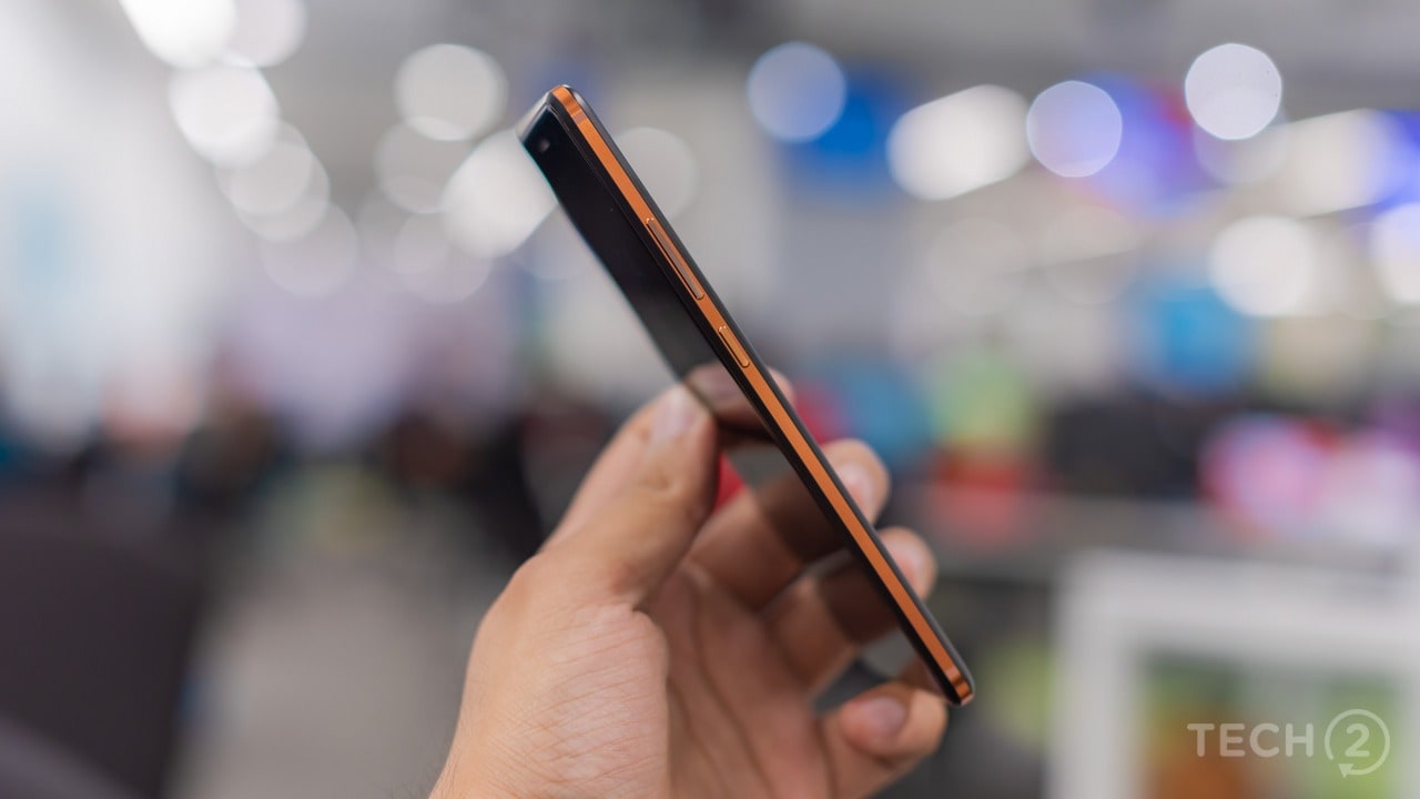 The ceramic feel coating covers the antenna bands and makes for a
grippier surface as opposed to the metal or glass. This also gives the
smartphone a solid feel, because its made from a single block of 6000
series aluminium and there’s no glass or an edge-to-edge display to
worry about when you drop it. In short, it feels like a tank.
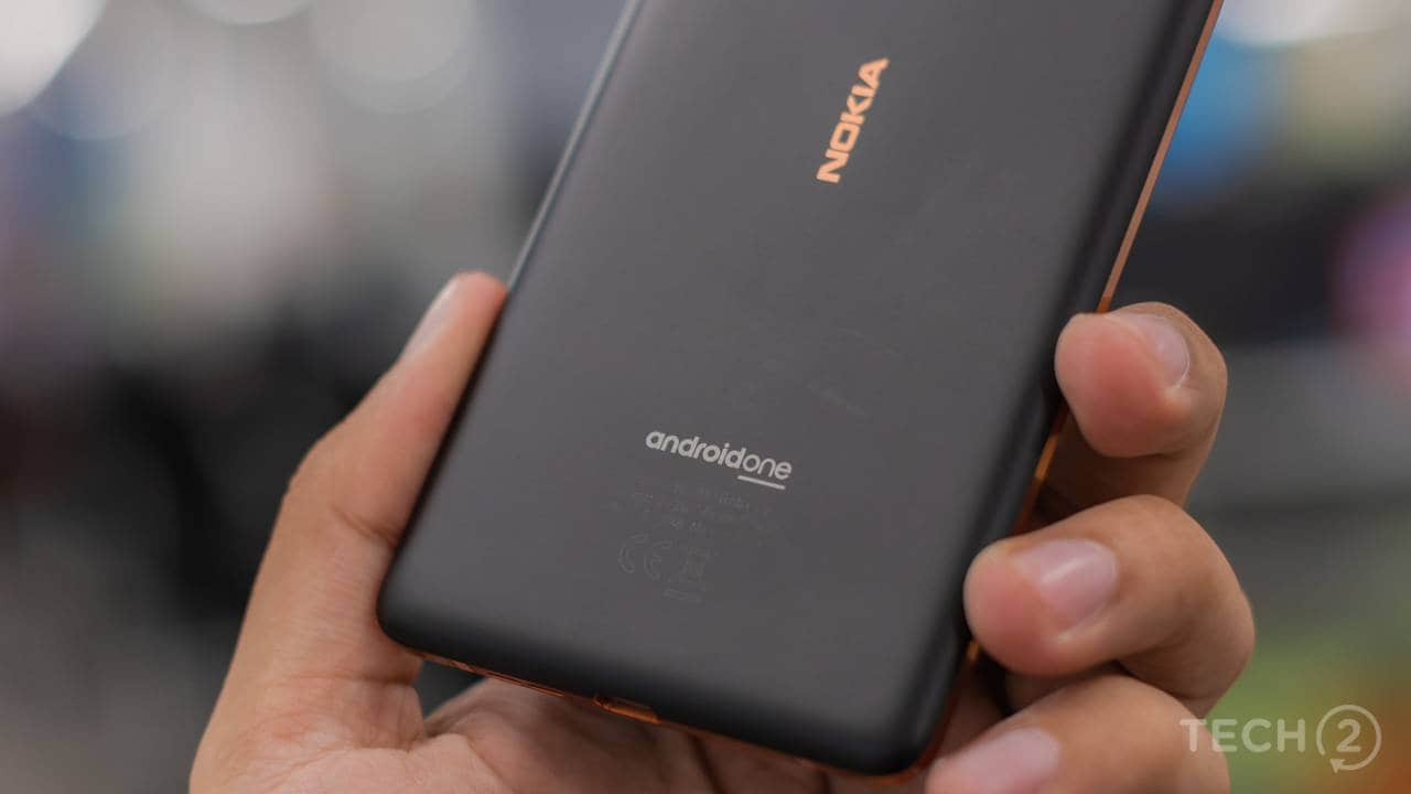
The best part is when you turn over the smartphone and read the fine print at the bottom. It’s “Made in India”! which is surprising, keeping in mind the level of quality they have achieved with the 7 Plus.
Features: 8/10
This is another area of the smartphone that Nokia seems to have taken care of. There’s a tall 6-inch LCD display sporting an FHD+ resolution. A top-notch Qualcomm Snapdragon 660 SoC (a first for India) paired with 4 GB RAM and 64 GB of internal storage. The internal storage is expandable using microSD cards of up to 256 GB.
Moving to the cameras, there’s a dual camera setup on the rear which includes a 12 MP sensor with a f/1.7 aperture along with a second 13 MP camera that features a f/2.0 aperture with a telephoto lens. The front-facing camera features a 16 MP sensor.
Connectivity options include, LTE Cat 6, 2CA, 300 Mbps DL/50 Mbps UL for the radios, Wi-Fi 802.11 a/b/g/n/ac, Bluetooth 5.0, GPS/AGPS+GLONASS+BDS, NFC. Unlike its elder sibling the Nokia 8 Sirocco, the 7 Plus features a 3.5mm headphone jack at the top of the smartphone and a USB Type-C port at the bottom.
The handset runs Android 8.1 Oreo with latest April security patch and is powered by a sizeable 3,800 mAh battery.
Display: 8/10
Firstly, there’s no notch. So, for those of you who have been waiting for a notch-less mid-range smartphone, this is the one to go for.
The display may not be as vibrant as the unit on the Oppo F7, but tips more towards the cooler tones, without being noticeably blue. While I prefer more natural-looking colours as opposed to saturated colours, the display does a decent job and appeals more to a mass audience with saturated colours. With that said, the brightness levels are good enough for viewing in direct sunlight, being able to read text and view images with no problems.
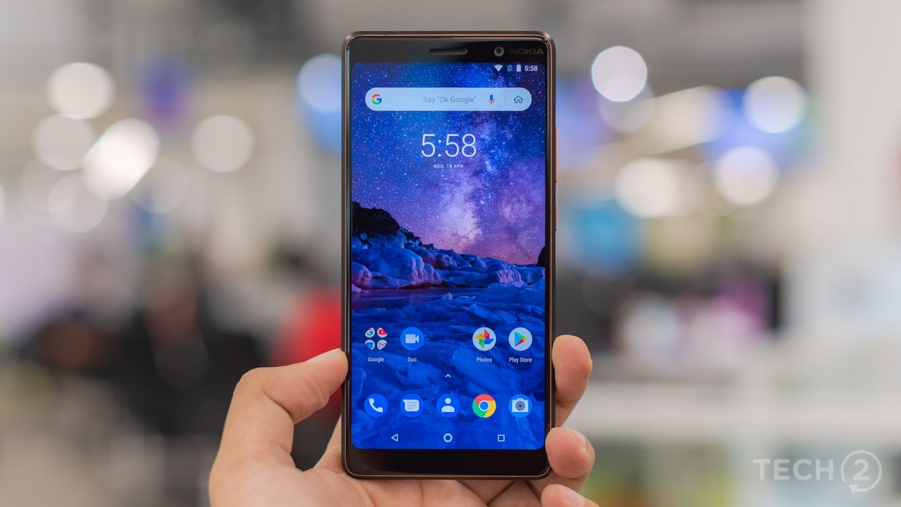 The 6-inch Full HD plus display features a pixel density of 402 PPI,
which is good enough for a mid-range device and comes in the taller 18:9
aspect ratio.
While the display seemed well calibrated overall, the stock software means that there is no tweaking with the hues and contrast levels, something that’s available on entry-level Xiaomi smartphones as well. But that would depend on whether you want to tweak this display as I did not find the need to do the same.
Being an LCD unit, viewing angles were pretty good and better than the stuff we have seen on the Oppo F7 and Vivo V9 this year. What’s even better is that display does come with an oleophobic coating meaning that fingerprints are rare and even if you do manage to smudge your display, they are easy to wipe off, which is a common problem with the Oppo and Vivo smartphones.
Software: 8.5/10
With the latest Android 8.1 Oreo software onboard, along with the latest April security patch, there is not much even I as a reviewer can rant or complain about here.
Nokia recently enrolled all its smartphones under the Android One program and this is a good move that comes at a time when most manufacturers are struggling to deliver software updates or even security patches.
The software experience is smooth and lag-free. The only area where I did notice some dropped frames was when zooming into photographs (clicked by the smartphone) in the default Google Photos app. Nokia should investigate this as the issue is present on the Nokia 8 Sirocco as well. Everything else including transitions and animations were smooth with the rest of the apps.
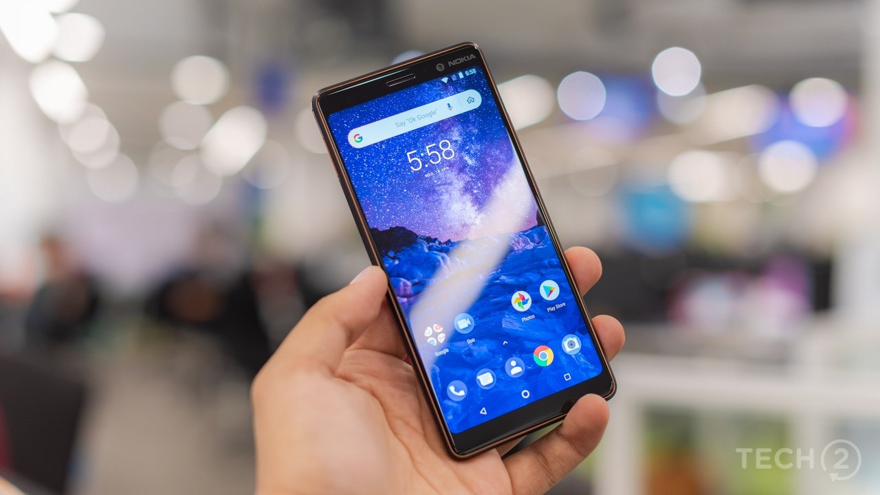 Talking about apps, it's nice to see a smartphone that does not have
duplicate apps by the manufacturer in them for once. The only custom
third-party apps are the Nokia Camera app and the Nokia Support app both
of which are useful. Once skinned almost all manufacturers will provide
their own version of the Gallery app and the Google Photos app, which
apart from adding to the clutter also hogs up space on the internal
storage. So, the switch to stock has helped here.
 As with most stock Android 8.1 interfaces like on the Pixel, there is
now a Pixel-like power menu that pops up from the right-hand-side when
you press down the power/unlock button. The theme again like the Google Pixel 2
will change from a standard white to stealthy black when you change to a
darker wallpaper. There are notification dots and previews as well as
one would expect on a stock Android One-powered phone.
Nokia has added a few customisable features to the almost stock software. This would include the ability to swipe down on the fingerprint reader to drop down the notifications tray. The fingerprint reader can also be used for navigation, but you cannot hide the navigation bar so it’s not all that useful. Apps that have not been optimised for the taller 18:9 display can be expanded with a single tap.
Performance: 8.5/10
The Qualcomm Snapdragon 660 is what keeps the show running on the Nokia 7 Plus. The recently launched SoC from Qualcomm is the first of the mid-range chipset to feature a manufacturing process (10 nm) that is identical to the SoCs found in premium flagship devices.
The chipset features the new Kryo 260 CPU (clocked at 2.2 GHz), which according to Qualcomm sees a 20 percent bump in performance as compared to previous CPUs in the 600 series SoCs. Handling the graphics is the Adreno 512 GPU that’s a bump up from the 509 GPU found in the Redmi Note 5 Pro that performed well despite being a budget smartphone.
With that said, the Nokia 7 Plus also becomes the first smartphone in India to feature the new mid-range SoC and as expected, it packs in quite a punch.
Be it playing 3D intensive games or simply browsing through your Facebook News Feed, I experienced no hint of lag or stutter. Games ran smoothly without dropping any frames and becoming hot. Real Racing 3 ran buttery smooth at a high resolution, showcasing good detail accompanied by a rocksteady framerate. The same goes for Asphalt 8: Xtreme that did not even see the device warming up running at ‘HPDI’ and ‘Better Quality’.
The only game that saw the temperature of the device rise was PlayerUnknown’s Battlegrounds (PUBG mobile). However, I managed to heat up the smartphone with the settings maxed out, but I did expect that to happen, since it is a graphically demanding title

Meet the Nokia 7 Plus. Image: tech2/Rehan Hooda
With that said, brands like Honor and Samsung are
holding the fort with mid-range offerings, but they somehow never got
it right.
The problems are basically to do with underpowered hardware, often
borrowed from budget smartphones. Ones that disappoint buyers when they
try out a smartphone that's priced well into the Rs 20,000 segment but
performs like a Rs 14,000 smartphone.In fact, you can thank Chinese smartphone manufacturers for bringing mid-range chipsets to budget smartphones spoiling the consumer when it comes to performance.
With that in mind, most smartphone brands have seen little success with the mid-range segment as they either try to copy notched displays from the premium segment devices or try and offer under-powered hardware, which rarely makes up for their mid-range pricing (example Vivo V9).
While Nokia too has stayed away from this segment for a while, HMD’s efforts to diversify into various segment saw something new come out of the Nokia stable this year, a perfect mid-ranger that not just looks good, but is practical and comes with power-packed performance figures that for once make a mid-range device worthy of its asking price. Say hello! To the Nokia 7 Plus, the first smartphone, worthy of the mid-range title in years.
Build and Design: 9/10
With most Chinese brands busy aping the Apple iPhone X and following its notch philosophy (you can now include OnePlus in that list as well), it was surprising to see Nokia go notch-less in 2018 with the Nokia 7 Plus back at the Mobile World Congress.
Simply, put, the design is practical, looks gorgeous enough to distract an iPhone X owner and is built like a tank.

Nokia has spent plenty of time designing this smartphone. Image: tech2/Rehan Hooda

The copper-coloured accents give the 7 Plus a classy look. Image: tech2/Rehan Hooda

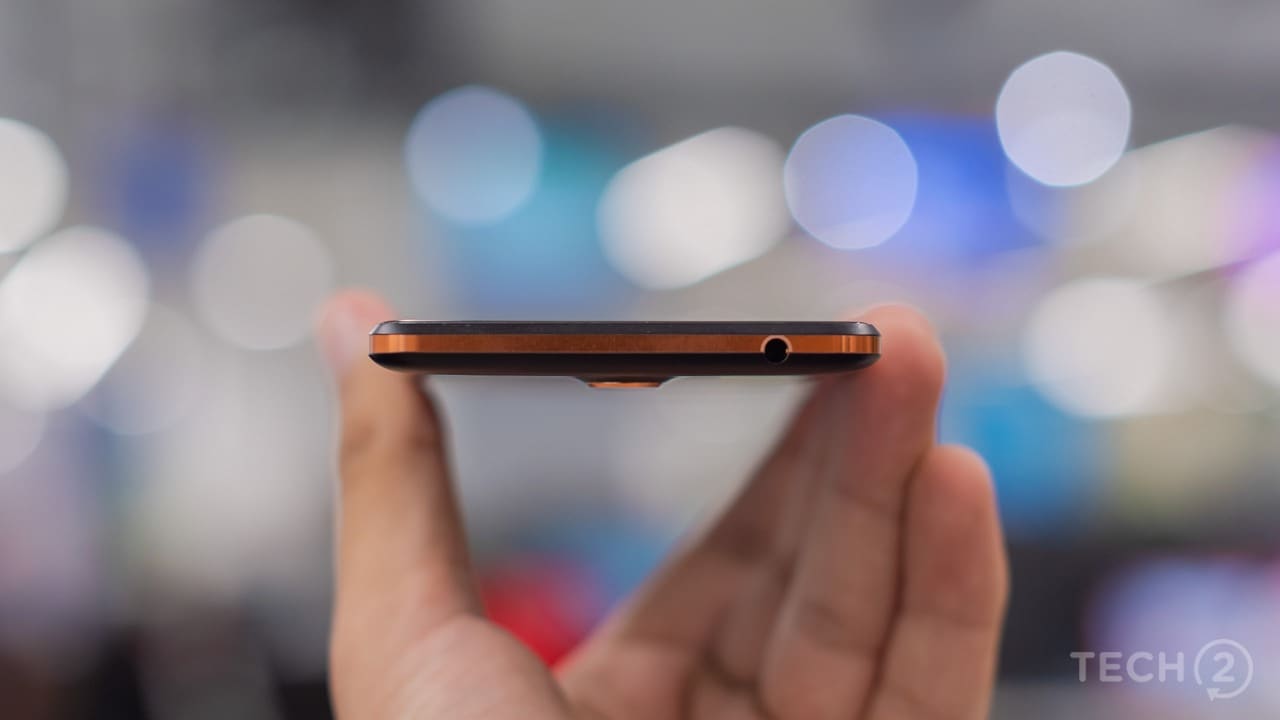
There's a 3.5 mm headphone jack at the top end. Image: tech2/Rehan Hooda

At the bottom you get a USB Type-C port with the single speaker grille. Image: tech2/Rehan Hooda

That copper accent! Image: tech2/Rehan Hooda
The best part is when you turn over the smartphone and read the fine print at the bottom. It’s “Made in India”! which is surprising, keeping in mind the level of quality they have achieved with the 7 Plus.
Features: 8/10
This is another area of the smartphone that Nokia seems to have taken care of. There’s a tall 6-inch LCD display sporting an FHD+ resolution. A top-notch Qualcomm Snapdragon 660 SoC (a first for India) paired with 4 GB RAM and 64 GB of internal storage. The internal storage is expandable using microSD cards of up to 256 GB.
Moving to the cameras, there’s a dual camera setup on the rear which includes a 12 MP sensor with a f/1.7 aperture along with a second 13 MP camera that features a f/2.0 aperture with a telephoto lens. The front-facing camera features a 16 MP sensor.
Connectivity options include, LTE Cat 6, 2CA, 300 Mbps DL/50 Mbps UL for the radios, Wi-Fi 802.11 a/b/g/n/ac, Bluetooth 5.0, GPS/AGPS+GLONASS+BDS, NFC. Unlike its elder sibling the Nokia 8 Sirocco, the 7 Plus features a 3.5mm headphone jack at the top of the smartphone and a USB Type-C port at the bottom.
The handset runs Android 8.1 Oreo with latest April security patch and is powered by a sizeable 3,800 mAh battery.
Display: 8/10
Firstly, there’s no notch. So, for those of you who have been waiting for a notch-less mid-range smartphone, this is the one to go for.
The display may not be as vibrant as the unit on the Oppo F7, but tips more towards the cooler tones, without being noticeably blue. While I prefer more natural-looking colours as opposed to saturated colours, the display does a decent job and appeals more to a mass audience with saturated colours. With that said, the brightness levels are good enough for viewing in direct sunlight, being able to read text and view images with no problems.

The display is crisp, but a bit on the saturated side when it comes to colours. Image: tech2/Rehan Hooda
While the display seemed well calibrated overall, the stock software means that there is no tweaking with the hues and contrast levels, something that’s available on entry-level Xiaomi smartphones as well. But that would depend on whether you want to tweak this display as I did not find the need to do the same.
Being an LCD unit, viewing angles were pretty good and better than the stuff we have seen on the Oppo F7 and Vivo V9 this year. What’s even better is that display does come with an oleophobic coating meaning that fingerprints are rare and even if you do manage to smudge your display, they are easy to wipe off, which is a common problem with the Oppo and Vivo smartphones.
Software: 8.5/10
With the latest Android 8.1 Oreo software onboard, along with the latest April security patch, there is not much even I as a reviewer can rant or complain about here.
Nokia recently enrolled all its smartphones under the Android One program and this is a good move that comes at a time when most manufacturers are struggling to deliver software updates or even security patches.
The software experience is smooth and lag-free. The only area where I did notice some dropped frames was when zooming into photographs (clicked by the smartphone) in the default Google Photos app. Nokia should investigate this as the issue is present on the Nokia 8 Sirocco as well. Everything else including transitions and animations were smooth with the rest of the apps.

Almost stock Android is a blessing! Image: tech2/Rehan Hooda

Android One is a good move. Image: tech2/Rehan Hooda
Nokia has added a few customisable features to the almost stock software. This would include the ability to swipe down on the fingerprint reader to drop down the notifications tray. The fingerprint reader can also be used for navigation, but you cannot hide the navigation bar so it’s not all that useful. Apps that have not been optimised for the taller 18:9 display can be expanded with a single tap.
Performance: 8.5/10
The Qualcomm Snapdragon 660 is what keeps the show running on the Nokia 7 Plus. The recently launched SoC from Qualcomm is the first of the mid-range chipset to feature a manufacturing process (10 nm) that is identical to the SoCs found in premium flagship devices.
The chipset features the new Kryo 260 CPU (clocked at 2.2 GHz), which according to Qualcomm sees a 20 percent bump in performance as compared to previous CPUs in the 600 series SoCs. Handling the graphics is the Adreno 512 GPU that’s a bump up from the 509 GPU found in the Redmi Note 5 Pro that performed well despite being a budget smartphone.
With that said, the Nokia 7 Plus also becomes the first smartphone in India to feature the new mid-range SoC and as expected, it packs in quite a punch.
Be it playing 3D intensive games or simply browsing through your Facebook News Feed, I experienced no hint of lag or stutter. Games ran smoothly without dropping any frames and becoming hot. Real Racing 3 ran buttery smooth at a high resolution, showcasing good detail accompanied by a rocksteady framerate. The same goes for Asphalt 8: Xtreme that did not even see the device warming up running at ‘HPDI’ and ‘Better Quality’.
The only game that saw the temperature of the device rise was PlayerUnknown’s Battlegrounds (PUBG mobile). However, I managed to heat up the smartphone with the settings maxed out, but I did expect that to happen, since it is a graphically demanding title

Commentaires
Enregistrer un commentaire